Acheson Walsh Studios

Acheson Walsh Studios wanted a new website and logo that would help them reach a broader audience of clients and was more visually representative of the studio and its work.

My Role

I rebranded the studio, designing a new logo, identity, and website. I wanted to give the studio a more mature look and feel, simplifying the website to let their work shine, and creating an identity that references the co-founders background in theater and puppetry.

Research & Wireframes

I spent time working through the original site to understand the current structure, color scheme, content, and branding. I wanted to have a firm grasp on what each of the successes and pain points were to determine if the site needed a full overhaul or just an update. The pain points outweighed the successes, so I decided a complete redesign would be the most efficient and cost effective for my client. I sketched out a several possible wireframe designs that included certain requirements that I felt were essential to the success of the site – bold images, minimal text, easy navigation.

Site User Flow

The original website had a lot of information on it and too many projects. I recommended they simplify the site in order to showcase their work more prominently. I redesigned their new site as a single page website to seamlessly guide potential clients through the breadth of their work, services they provide, and a more direct way to contact them. This design kept clients on the same page, allowing them to smoothly jump to each section using a static nav bar.

Platform Hosting

The original website was hosted on Wix, which the client initially preferred out of familiarity. I recommended switching from the Wix platform to Squarespace as I felt that not only does Squarespace allow for more sleek, clean design, but the UI is intuitive and easy to edit no matter their technical background. My client wanted easy access to edit and update their website as needed and agreed that Squarespace was the better way to go.

Visual Design

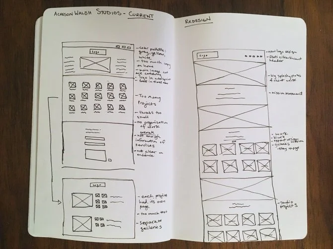
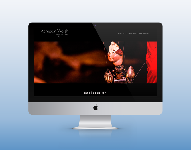
The original website had a muted color palette of yellow, warm grey, and blue, that was inconsistent throughout the company branding and didn’t provide a clear, relatable aesthetic. I chose to use a simple color palette, but with bold contrasts. A black background, white text, and big, splashy images with moments of red throughout, give the website a theatrical, cinematic quality that speaks to the work the company specializes in.

Rebranding

I redesigned my client’s logo to better reflect the character of the company. It was important to my clients that the logo reference their background in theater and puppetry in some way. I took these requirements and focused on designing a crisp logo with hint of whimsy, which I felt best embodied the unique nature and high caliber of work that the company produces.

After discussing a few options, my clients and I decided to go with a more streamlined aesthetic. The cross hatch is a nod to their love of marionettes with a focus on the studio name giving the overall logo and branding a blend of design and art aesthetic, capturing the way they approach the work they do.